RC Website Group’s Reading Web Design provides Reading, Pennsylvania the best Web Designs. We will meet you in person!
RC Website Group offers Reading Web Design service at an affordable price!
We can help you with any of your ONLINE IT business needs …
RC Website Group has a team of Reading Web Developers, Graphic Designers, Programmers & SEO Specialists all ready to help.

Reach out to us today. To help provide all of Reading Web Design, we also provide free quotes! Ask us for a quote whether you are considering a CMS Package or want a Reading Web Design team.
Our approach is from the inside out. We listen carefully and expand your initial idea into creative options for your selection. Because we have led many clients through this detailed development process, we are able to present concepts within your means.
This clear and careful formulation of your website is what permits a convergence of the programming, design, media, and marketing professionals, each enhancing the work of the other. Your site will be a harmonious blend of colors, images, and messages to achieve your personal and business objectives.
Do you need SEO? We offer Reading SEO services as well! Please contact us for details.
The excitement of staying ahead of rapidly evolving design and technology developments keeps us energized. We love what we do because we are good at it and enjoy the respect of colleagues, clients, and friends who admire our work.
Contact Us to ask us any questions or to get started!
… Still Looking for More Help on Deciding your best Online options?
RC Website Group has a comprehensive Website Help Guide available for purchase …
Chapter 24 / Section 2 – How Responsive Design Can Benefit A Website?
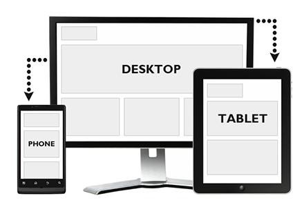
The changing design trends and fashions that have been seen in web design over the years have changed quite regularly, and in many cases, these have developed because of the demands being placed by web users. At the heart of the philosophy behind responsive design is the idea that websites can be created with features that will allow them to be viewed by any type of device used to access the internet. This can be particularly challenging as there are many different types of products that can now access the internet, from eyeglasses with a tiny screen to watches with a screen on the face.
An Overview Of Responsive Design
The key philosophy that underpins the responsive design movement is that the websites that are created should be as flexible as possible, and will be as useful on a small cell phone screen as it is on a desktop computer. The way that most designers will achieve this is to make sure that the content isn’t fixed to a certain size but can in fact be scaled to match the size of the screen being used to get to the content. One reason that this type of design is referred to as responsive is that there are small pieces of programming in the website that will actually identify the device used to access the website and change the display to suit the device.
Why Web Users Like Responsive Design
The main attraction for those who browse the web regularly on different devices is that websites designed in this way will adapt to their device, meaning the content is accessible wherever you are. As well as providing a more complete experience for the web user, it is also likely to leave visitors feeling more satisfied when they leave the site, as they know they can get to that information using another type of device. The web is full of choices for the casual internet user, so one important part of owning a website is making sure there are no reasons on the site that would encourage users to choose a rival.
The Most Important Aspects Of Responsive Web Design
The main feature of this design philosophy is that the web developer will place a grid behind the actual content of the website, and this grid is then used when shrinking or inflating the size of the content to match the screen of the device. The grid also works when pictures are a part of that content, and these are also shrunk and inflated to match the device. When it comes to actually create a website in the responsive design mold, the most popular approach is to create a simple, attractive website for basic browsers and then to add enriching features that are then used on more powerful devices and browsing software.
Why Should You Use Responsive Design?
Being able to deliver content in the most user-friendly way is a big plus point for website owners as it gives the visitors to the site the best experience. Tablet computers and cell phones are just the starts when it comes to devices that can be used to access online content, and with such a large potential audience available through these devices, having a website that allows all web users access to the content of your site can only benefit the business.